Almost at the end of the line! The ninth challenge was to use buttons. I had an idea to use buttons of all sorts of colors, but it didn't turn out the way I imagined it. I switched over after spending some time on the other card and just made more of a clean and simple card with the yellow buttons as the centers of the flowers.
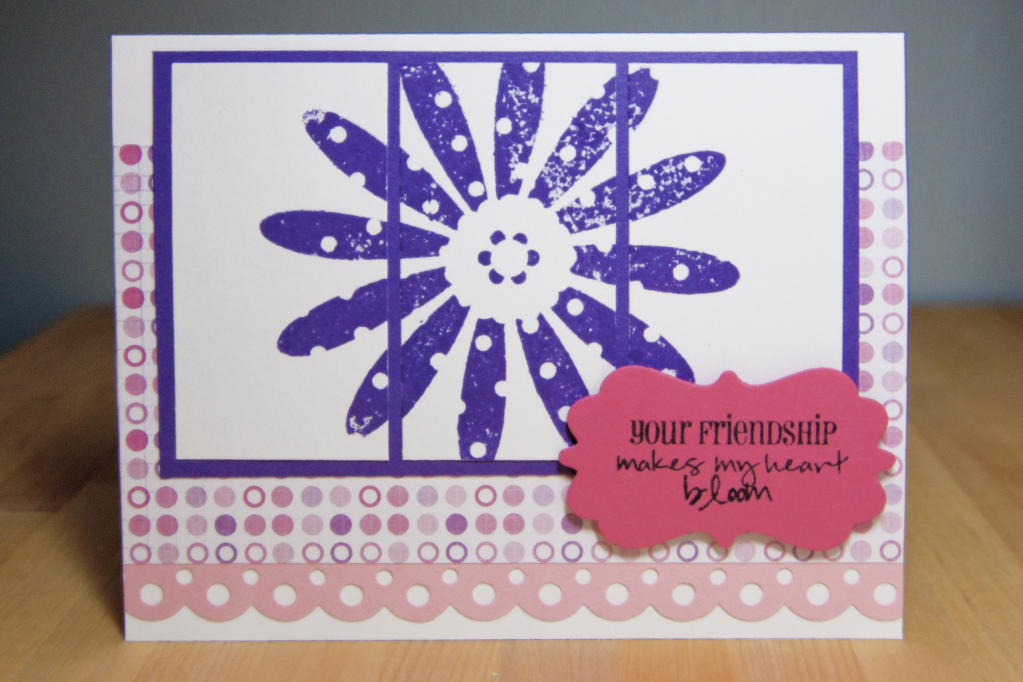
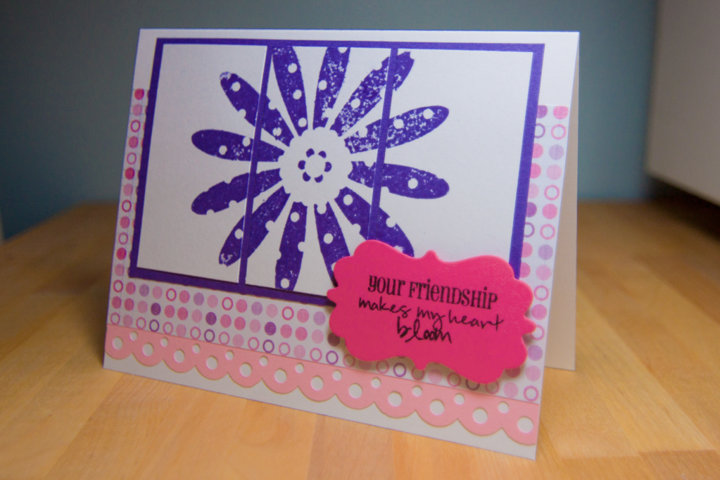
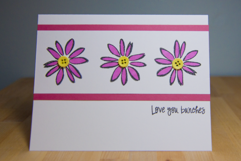
The flowers are from a set I bought a while ago from Autumn Leaves. It's so old that I could barely pull the stamp off the plastic sheet! I wasn't storing them with my other stamps, so I had forgotten that I had that set. I liked the "sketch-like" look of the flowers. I think it works to have some that stamp that way as opposed to always having the crisp, sharp edges.
The sentiment is from Pink by Design's set called "Our Kids." Even though there are a lot of encouraging sentiments for kids and students, they really work for all sorts of occasions too. If you take a look at the stamp sheet, you'll see that there are a TON of options! Now that's what I like in a set!
Saturday, July 28, 2012
Pink by Design Two Year Anniversary Extravaganza: Challenge 8
Moving on to the eighth challenge! That was to have a project with ribbons or bows. I love having ribbon on the card, but I usually just wrap it around and tape it to the back of my layer. I am not good with bows at all! It's always difficult for me to tie them, and then they never lie correctly. I was still determined to put a bow on this card though.
The frog was cut from the Cricut Lite Playtime cartridge that came with my Cricut Expression from Walmart. I didn't really like the images of the children on it, but then when I looked carefully, they did have some cute images on it as well, including this frog! I thought it looked a little bland so I added white faux stitching to the lily pad. Also, any time there's a layer for black for the eyes, I never cut the whole thing out. I hate wasting that much paper, so I usually cut everything out and glue a small piece of black over the holes that were cut out.
The sentiment is from Pink by Design, of course. And so far I'm still sticking to the "don't-use-the-same-set-twice" thing! This is from "Be Mine."
Pink by Design Two Year Anniversary Extravaganza: Challenge 7
Yup, still moving along with these challenges! The seventh challenge was to make anything with a tag. I decided to make a card with a little pocket on the front for a tag. So far I don't think I've used a stamp set twice, so I was looking through the collection I have to find one I hadn't used yet, so I chose my coffee sets that I won from Tana, a fellow PBD crafter! Although I myself don't drink coffee, pretty much EVERYONE in my life does, so I was ecstatic to get these sets. They're called "Perk Up" and "Make It a Venti."
I used a Martha Stewart punch called "Stars" to give the pocket a little extra something. If you noticed, I used the same purple cardstock and same patterned paper as my last project because I had it out on my small portable table behind me. I am totally making a mess of the apartment! Thankfully, Howard has been nothing but supportive, even making breakfast and lunch for me!
You can also see that I'm getting pretty attached to embossing with white powder. I just think it looks great to put a sentiment on colored cardstock. These coffee stamps with the mugs and cups on it really are so much fun. I remember making a mini album type deal for my cousin when we thanked her for leading our church group in our annual coffeehouse. I can't wait to find more occasions for these 2 sets.
Pink by Design Two Year Anniversary Extravaganza: Challenge 6
The sixth challenge was a sketch challenge. Typically, I'm not that big of a fan of sketch challenges, especially when there are so many elements that are part of it. But I just have to remind myself that you don't have to follow sketches exactly. I always feel as if I have to! Since I did a card instead of a layout, I cut back on some of the pieces since I was only using a 5.5x4.25 base instead of a 12x12.
Since I had used blues and greens on other cards, I wanted to make this one with girly colors, so I found a purple and pink patterned paper in a new paper pad I bought recently from Michaels (Recollections is my favorite for all the variety and the great price!). From there, I used a Martha Stewart scallop dot paper punch. I knew I wanted to do 3 rectangles with parts of flowers on them, but the one flower I actually liked was too big! Then I thought that I'd stamp it across all 3 pieces at once like a triptych (haha, Howard and I were talking about that like, yesterday or something because I had gone to see the cloisters in Manhattan during a high school trip for Romance Philology).
I chose the sentiment from "Friends to the End," which was the stamp of the month for October 2011. I haven't yet chosen to do SOTM because I try to watch what I spend and only buy stamps once in a while nowadays. The 2-year anniversary is definitely a good reason to though!
The funny thing is that the entire time I was making it, I kept saying to Howard, "I don't like sketch challenges!" and when I finished I actually said, "Hmm, I actually like it!"
Pink by Design Two Year Anniversary Extravaganza: Challenge 5
The fifth challenge stumped me for a bit, so I decided to Google image search "ombre cards" just to get a better idea of what to do. I had actually done something like it already with my shoe card as I used 3 different shades of blue! I decided to use the same colors since I had scraps of the paper already. I looked at my punch box and found a tiny star punch. Man, the little ones that you get for $1 are really difficult to use! But at least they punch out nicely!
Once I had the stars punched out (I punched out way more than I needed), I realized that I was going to come across an issue with spacing! It was bothering me as I tried to figure out just how much room to leave in between the stars. I even had to ask Howard if he could figure the math out for me. I just played around with it for a while until I had something that kinda worked, haha.
I finally opened my Bahama Blue Memento ink pad to stamp the sentiment from "Simply Everything." In hindsight, I think it might've looked nicer if I used a non-blue color? Not sure. I admit that this didn't come out as nice as I had it planned, but once I finished it, I thought of a different method to try an ombre card like this in the future. I'll have to give it a go ... you know, when I'm not under time crunches with these challenges! :)
Subscribe to:
Posts (Atom)